Mooo Ice Cream and Shakes
About the Project
We Delivered
Branding
Pistachio Colour Scheme!
Cone wraps
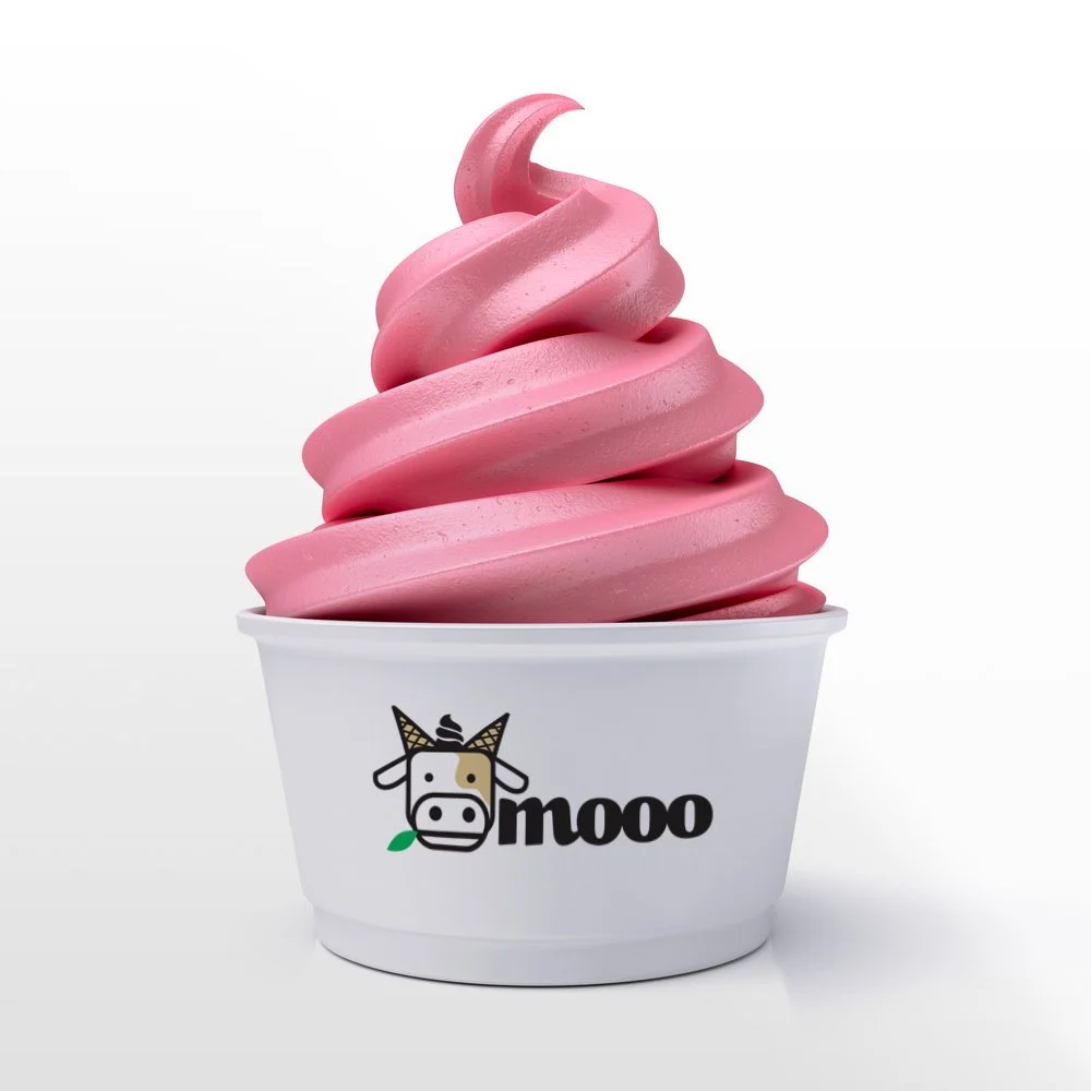
Ice cream cups
The Mooo Ice Cream concept came to the agency from an existing client who ran several successful retail enterprises. After seeing a vacant shop in Chester he asked us to take his idea of the Mooo brand into something more tangible.
From photographs of the shop front we added a distinctive mint/pistachio green, that not only referenced the rural source of the milk used in the icecream, but also one of the flavours sold, as well as being a fresh colour scheme.
Our cow featured a distinctive “Mr Whippy” tuft and cornets for horns! The project required more research into viability due to the cost of retail rents and rates which proved unworkable, but the branding was a solid branding foundation - we still love!
This is a fun bit of branding of which we were immensely proud. So bring it on!

Simple and fun design for ALL ages!

Upturned 'cone horns' and 'whippy hair' were great fun on this brand

