Coleherne Group
About the Project
We Delivered
Branding
Website Design
Van livery design
Signage
PDF presentations
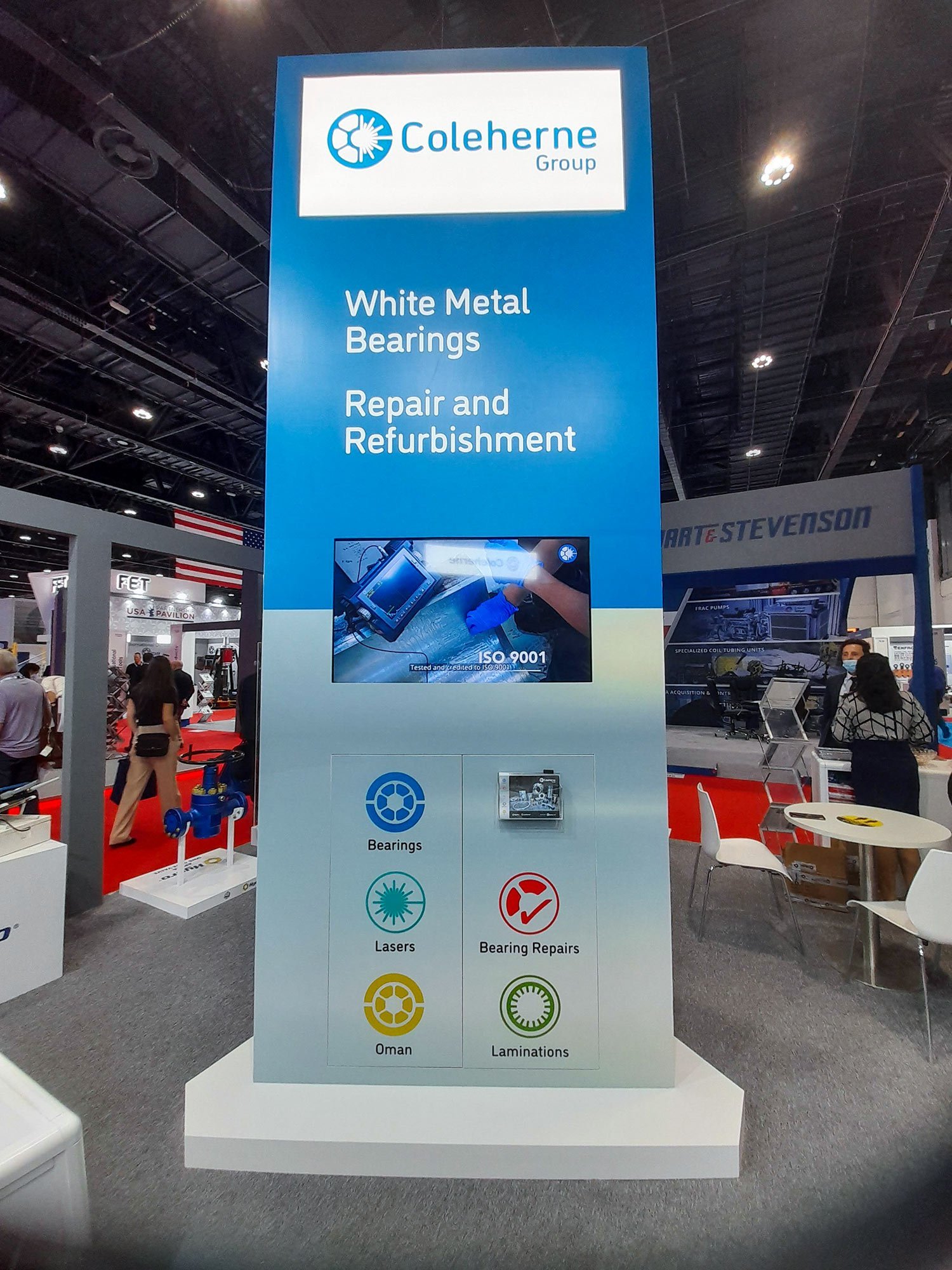
Exhibition graphics
A modern brand to reflect a highly skilled engineering company
Established in 1905, Coleherne supports critical industries with specialized fluid bearings and laser cut laminations. They sought advice to improve their branding and expand their presence in the Middle East. To enhance their identity, we used the clean and modern DIN font, commonly used in engineering. The roundel combines their core businesses of fluid bearings and laser cutting, representing their expertise. We also designed roundels for their other activities and created graphics for Middle East exhibitions, improving their corporate identity and website. These efforts have positioned Coleherne as a prominent player in precision engineered bearings.

We draw on a clean visual engineering language

Suggested van livery

Use of clean white space enhances the design

The stainless steel effect and 'Coleherne Blue' are core elements of everything we designed

Simple and uncluttered, making the product the hero

Yellow taken from the partner company Hydro differentiates Coleherne's Oman operation

Treatment of imagery makes the product the star

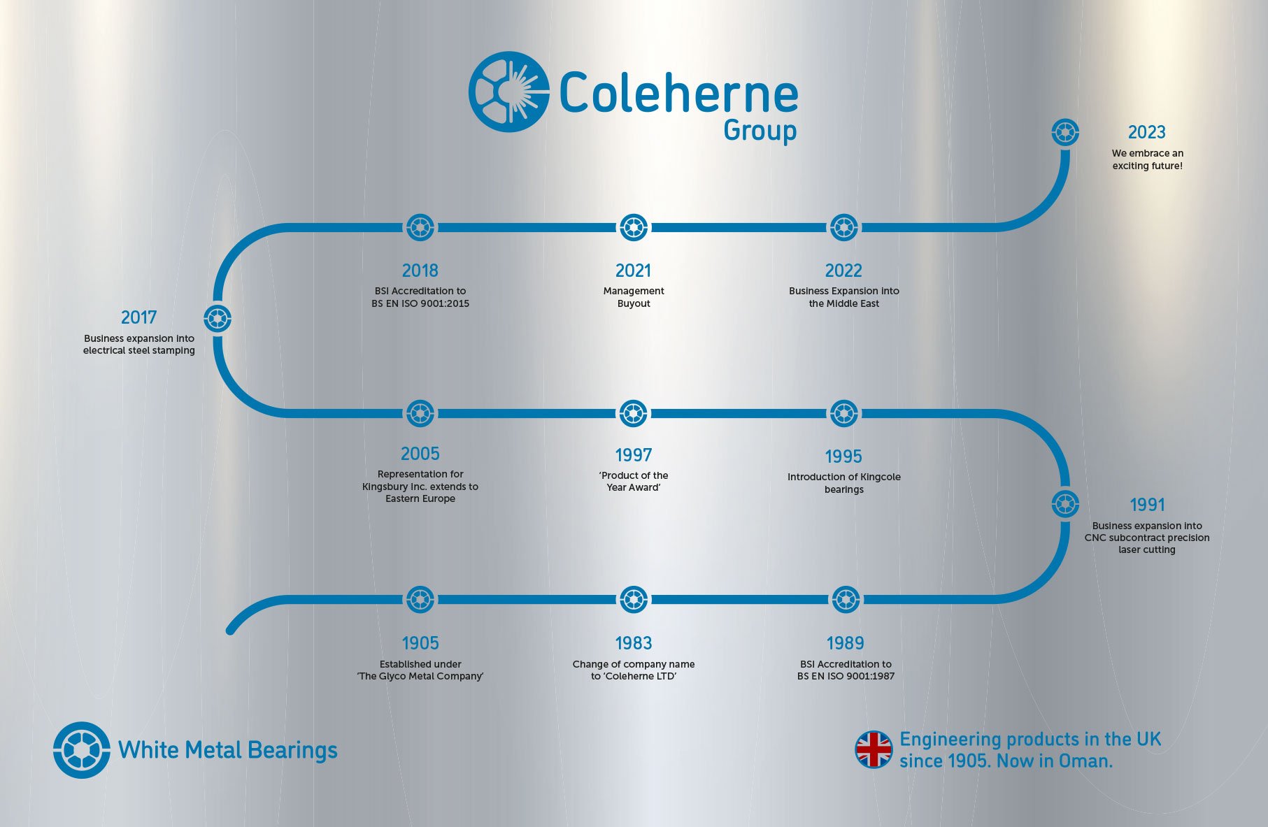
A timeline that optimises use of space - now mounted in the reception area

